Communicating your story effectively with data can be the tipping point between winning or not winning an award. Below, are four takeaways on what makes the most impactful charts, using examples from IPA Effectiveness Award-winning papers in 2022.
1. Follow the ‘Three Second’ Rule
If you can't understand what a chart is trying to tell you in three seconds, you need to simplify it. Prioritise simplicity and clarity in the design of your charts to make them immediately comprehensible. Use chart titles and simple annotations to tell readers what you want them to take away from the chart, and remove anything that you think isn’t necessary to their understanding (such as gridlines, axes, or legends if they might distract the reader).
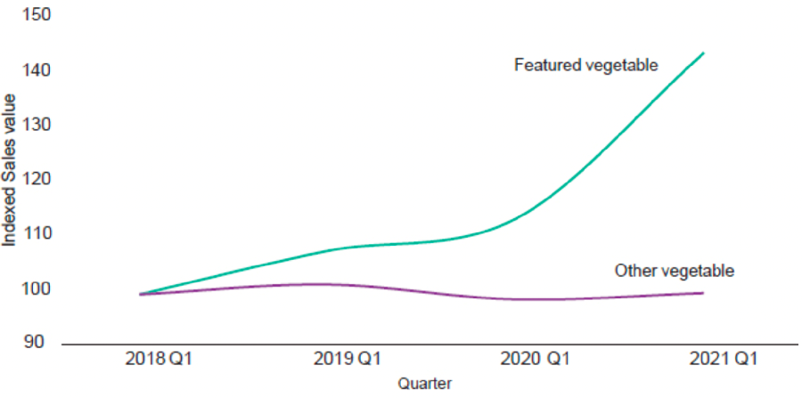
The ITV/ VegPower case won a Gold in the IPA Effectiveness Awards 2022 for getting children to eat more vegetables by turning the likes of broccoli and courgettes into animated villains that kids had to ‘eat to defeat’. It included this simple but effective line chart below. The chart is entitled ‘Sales of featured veg increased the most’ and clearly visualises how the sales of vegetables given the villain treatment by the campaign outgrew those of non-featured vegetables. By removing gridlines, truncating the vertical Y-axis, and using appropriate titles, the chart has more impact.
Fig 41: Sales of featured veg increased the most
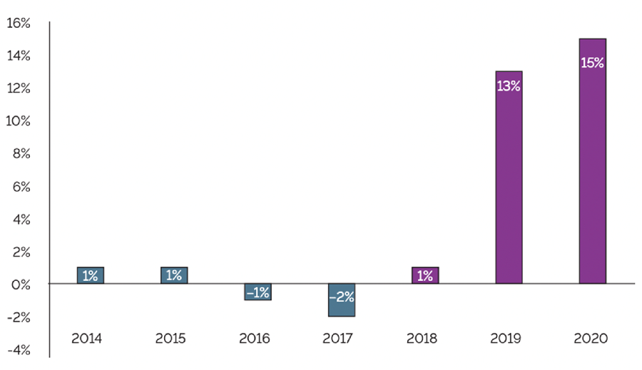
The 2022 IPA Effectiveness Awards Grand Prix-winning case about Cadbury Dairy Milk also has several very simple charts that perfectly illustrate its story and strip out extraneous material, in a no-nonsense, and straight to the point approach.
Fig 40: Declines in penetration were reversed with 75% of British households buying Cadbury Dairy Milk again
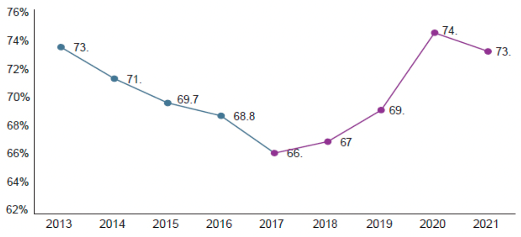
Figure 41: The declining trend of Cadbury Dairy Milk value sales reversed
2. Set the scene and tell the story
Clearly setting your campaign objectives is key to demonstrating effectiveness and translating these objectives into visuals will add hugely to the overall narrative flow of your case study. Consider how each chart can illustrate the story you want to tell.
This series of four charts from Waitrose (Silver, 2022) uses a different but clear headline style and simple visuals to set the scene and outline the challenges that the brand needed to overcome.

3. Contrast where you were with where you are now
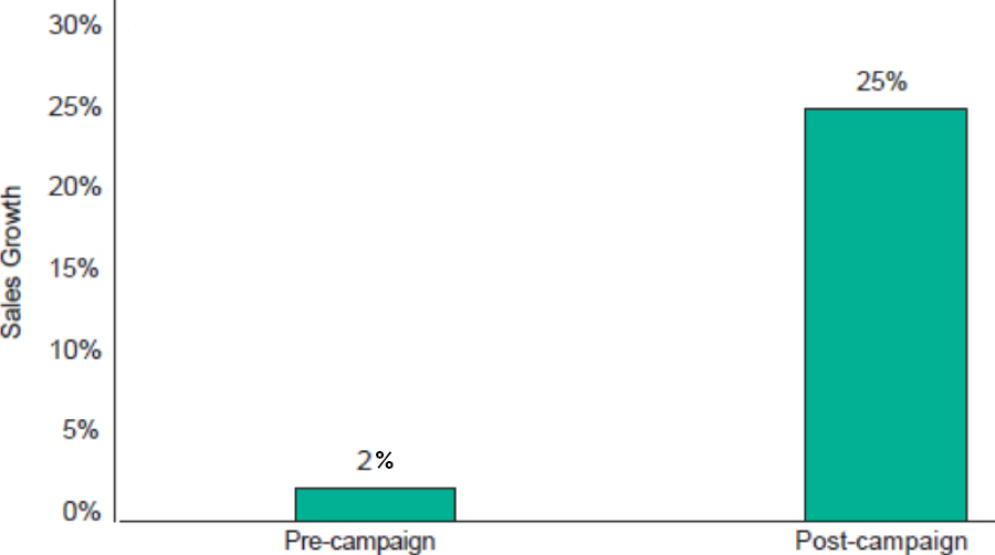
The ability to include a chart showing a strong contrast between the position of the brand before and after communications according to the campaign’s key metrics will be one of the biggest determinants of whether you are judged to have demonstrated work was successful. The examples below from ITV/Veg Power and KFC (Gold, 2022), immediately communicate the significant uplift in a respective key metric recorded after campaigns.
Fig 35: The campaign made kids want to eat more vegetables
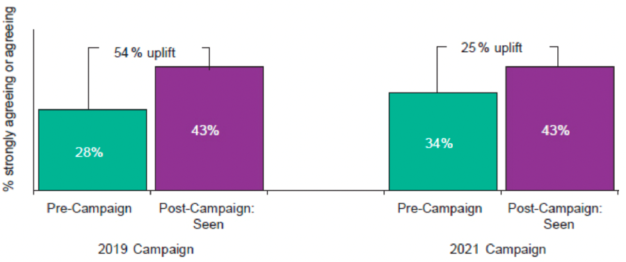
Figure 51: KFC annual same store sales percentage growth
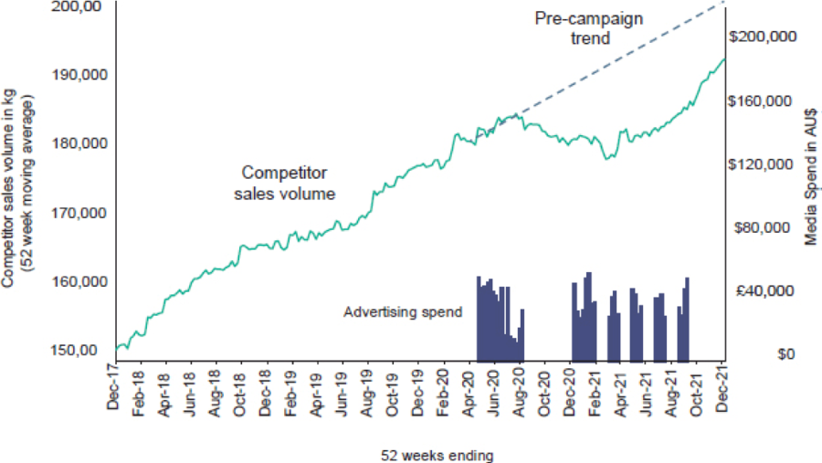
4. If you can, show where you might have ended up without communications
Where it is possible to do, your case can be strengthened by showing where you might have been if there had been no communications. The case about canine treat brand Schmackos (Gold, 2022) includes the chart below. This extrapolates forward from the previous trend in competitor sales to show the difference between where the brand's competitors might have been if Schmackos had not re-started its advertising, and where the competitors actually were after the advertising investment by Schmackos.
Fig 38: We took a bite out of competitors’ growth
However, this kind of counter-factual 'What if..?' chart is most easily developed using the outputs of an econometric model (though typically about half of the winning cases in the IPA Effectiveness Awards have used econometrics). A good example is in the 2020 Gold-winning case study from Guinness about its long-running 'Made of More' brand advertising strategy.
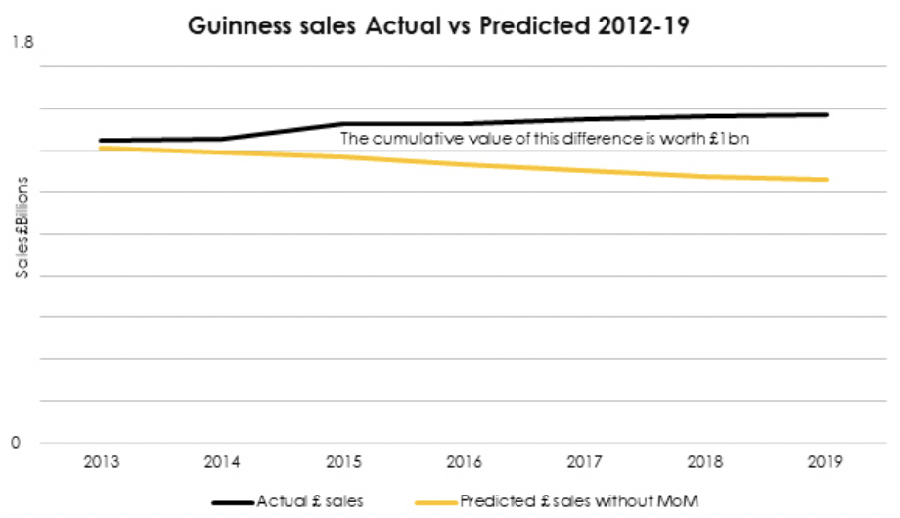
As the chart shows simply, the cumulative difference between the model's predicted UK and Ireland sales of Guinness from 2012 to 2019 without the 'Made of More' advertising and the brand's actual sales during that period was worth £1bn to Guinness over eight years. You don't have to work on a brand as big as Guinness to produce a chart along similar lines but access to econometrics data will certainly make it easier.
Data visualisations can be such a powerful way of telling your story, that by following a few simple principles when you are designing charts to go in your IPA Effectiveness Awards entry (due 18 April), you can help your chances of picking up a trophy on Awards Night.
Find out more about the IPA Effectiveness Awards 2024 and download your entry pack.
The opinions expressed here are those of the authors and were submitted in accordance with the IPA terms and conditions regarding the uploading and contribution of content to the IPA newsletters, IPA website, or other IPA media, and should not be interpreted as representing the opinion of the IPA.


Last updated 14 May 2025